

SUMMARY: The Living Planet Index is the biodiversity metric that always claims the headlines. Unfortunately many of these headlines are wrong. The index is very easy to misinterpret.
The Living Planet Index reports an average decline of 69% across tens of thousands of wildlife populations since 1970. This does not tell us anything about the number of individuals, species or populations lost, or even the share of populations that are shrinking.
Before reporting on the Living Planet Index we should understand what it actually tells us about the world’s wildlife. We should also be aware of the misconceptions and pitfalls of using this index to capture the changes in more than 30,000 of the world’s animal populations.
“In the last 50 years, Earth has lost 68% of wildlife, all thanks to us humans” (India Times)
“Humanity has wiped out 60% of animal populations since 1970, report finds” (The Guardian)
“We’ve lost 60% of wildlife in less than 50 years” (World Economic Forum)
These are just three of many headlines covering the Living Planet Index. But they are all wrong. They are based on a misunderstanding of what the Living Planet Index shows.
I sympathize with the journalists. Interpreting this metric is hard. I’m sure I’ve made similar mistakes in the past: using the terms ‘decline’, ‘lost’, and ‘fall’ interchangeably in biodiversity discussions. Combine this with the complexities of ‘populations’, ‘species’ and ‘extinctions’, and it gets complicated pretty quickly.
Before reporting on the Living Planet Index we should understand what it actually tells us about the world’s wildlife. We should also be aware of the misconceptions and pitfalls of using this index to capture the changes in more than 30,000 of the world’s animal populations.
What does ‘average decline’ actually mean?
The Living Planet Index (LPI) measures the average change in the number of individuals across the world’s animal populations. A ‘population’ is defined as a species within a geographical area. So, despite being the same species, the African elephant in South Africa and Tanzania are counted as different populations.
Let’s take a look at an example to see how the LPI is calculated. This will not only show us how easily this figure can be misinterpreted but also why we should be careful when assuming that it gives us an accurate picture of what’s really happening to wildlife populations.
We’re going to take a real-life example of two populations of the Black rhino: one in Tanzania and one in Botswana. In the first row of the table we see their population size in 1980: there were 3795 rhinos in Tanzania, and only 30 in Botswana. In the following decades intense poaching in Tanzania has plunged its population to critically endangered status: in the second row we see that by 2017 there were only 160 rhinos left. Things in Botswana actually improved over time: its 30 rhinos increased to 50. The difference between their population size in 1980 and 2017 is shown in the third row: this represents the number of animals lost over time. And in the final row we see the percentage change in population size for each.
The Tanzanian rhinos obviously did not fare well: they lost 96% of their population. The group in Botswana did much better. In fact, their numbers increased 67%.
If we calculate the average change of these two populations – just as we would do in the LPI – we get a value of -15%. Take the average of the change in Tanzania (-96%) and Botswana (67%). This means the Black rhinos saw an average decline of 15%.1
The common misinterpretation of this – where headlines would incorrectly report that “we’ve lost 15% of animals” – is shown in the far right column. There we’ve summed these numbers to show the two populations combined. In 1980, the total number of animals was 3825. We then lost 3615 of them, to give us only 210 in 2017. This means we actually lost 95% of the rhinos. Not 15% like the LPI might wrongly suggest. The LPI is therefore a very different measure from the number or percentage of individual animals lost.
But this also highlights an even greater danger when reporting the LPI. By averaging these two populations we’ve ended up pretty clueless about the status of either of them. A 15% decline would suggest that the Black rhino is not doing particularly well, but has only seen a moderate decline over several decades. The true situation could not be more different. The Black rhino in Tanzania has lost 96% of its rhinos and has become critically endangered. On the other hand, something is going right in Botswana because its numbers have increased.
Seeing a moderate 15% decline might mean we don’t prioritize the Tanzanian black rhino when we really need to. And we might lose out on an important lesson from Botswana on how to increase numbers in critically endangered populations. This is why a more population-specific approach to conservation is needed, as I discuss in the dropdown box at the end of this article.
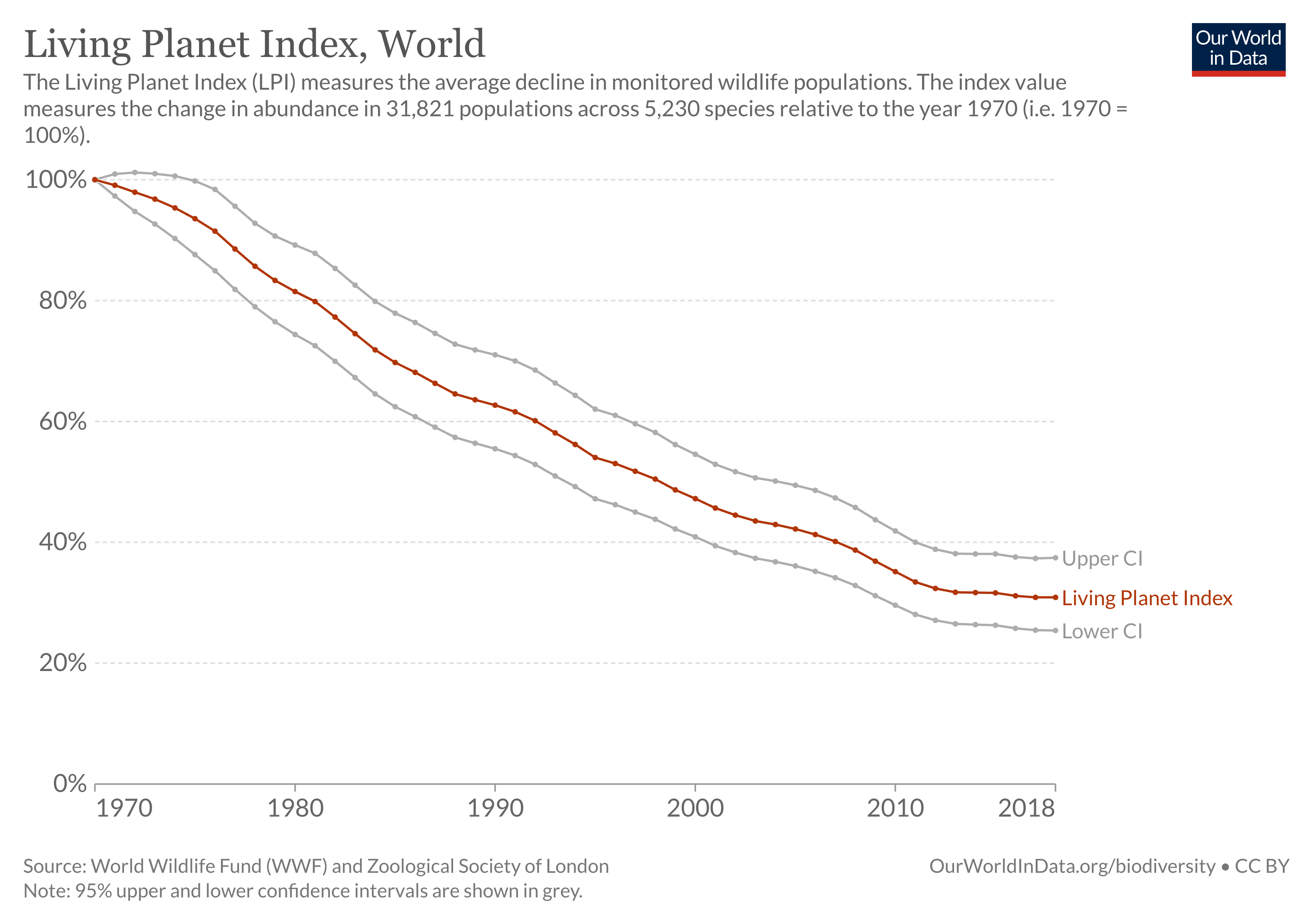
The Living Planet Index tells us that studied animal populations have seen an average relative decline of 69% since 1970
Let’s then dig into the actual results of the LPI. The above headline is the main message of the 2022 Living Planet Index report.2 It tells us that from 1970 to 2018, there was an average decline of 69% across studied animal populations.
What types and how much of the world’s wildlife does the LPI cover? In the latest report it covered 31,821 populations of 5,230 species across the world. It only covers vertebrate species – mammals, birds, fish, reptiles and amphibians.
It includes a large number of populations from each world region. In the latest report, the authors significantly increased the number of studies that were included in languages other than English. The number of included species from Asia and the Pacific increased by a quarter since the 2020 report. For Africa, species coverage increased by 37%. And most notably, it expanded by 66% across Latin America and the Caribbean.
This is great progress. However, the tropics are still underrepresented relative to Europe and North America. This is not ideal, considering the tropics are home to the greatest diversity of species and is where wildlife is most threatened.
This reveals two further limitations. First, it only covers a tiny percentage of species: Only 16% of known bird species; 11% of mammals; 6% of fish; and 3% of amphibians and reptile species. It’s hard to say how representative the available data is: it’s often the case that the species we are most concerned about (deservedly) get the most attention in the research. Second, many taxonomic groups are not included at all – nothing on insects, fungi, coral or plants. This is largely due to data availability – it’s easier to count bears than ants. Still, we should be wary of generalizing these results to all life on Earth. [In our FAQ on the Living Planet Index I look at the geographical and species breakdown of data availability, and where it’s sourced from].
The global LPI is shown in the chart, where the value in 1970 is indexed to 100%. As we see, this has fallen to 31% in 2018, signifying a 69% decline.
To be clear once again: the LPI does not tell us the number of species, populations or individuals lost; the number of extinctions that have occurred; or even the share of species that are declining. It tells us that between 1970 and 2018, on average, there was a 69% decline in population size across the 31,821 studied populations.
Effective conservation means we have to look past the average
To tell the real story on biodiversity, we have to be conscious of how the headlines are communicated. Losing 69% of the world’s wildlife within decades would be devastating. Thankfully it isn’t true.
But, this shouldn’t detract from the fact that the loss of many wildlife populations is deeply concerning. Unfortunately, averages are not particularly helpful in understanding what and where these populations are. When we look at more detailed analyses of the LPI we find that actually this 69% average decline hides even more drastic declines in some populations.
If we want to protect our most endangered species, these are the ones we need to prioritize. The average index unfortunately hides these populations from view.
We need to not only be careful with how we report the headline index itself. But we also need to be aware of what it does, or more importantly, does not tell us about how global wildlife is changing. As I cover in a related article, the Living Planet database itself is an incredible resource that allows us to dig deeper into the individual stories of the 30,000 populations that have been reduced to a single number.
Denne artikkelen ble først publisert av Our World in Data, og republiseres av Transit Magasiin etter Attribution-ShareAlike 3.0 Australia (CC BY-SA 3.0 AU).